Designing Fingerpost Signs That Match Real Geography
A fingerpost sign — the kind with several arrow-shaped plates radiating out from a single post — is one of the oldest pieces of physical wayfinding we still build. Most of the ones you see in gardens, holiday cabins, and roadside curiosities are decorative. The arms point at neat angles. The destinations are personal. The geography is suggestive.
Bearing-accurate fingerposts are different. Every plate points at the actual compass direction of its destination, calculated from real GPS coordinates. The distances are real distances along the surface of the planet. Once you start building this kind of sign, you stop thinking about the angles and start thinking about where you're standing on the Earth.
This article is about how to design the second kind. It assumes you're going to put the sign somewhere and that you want it to be right.
The visual difference
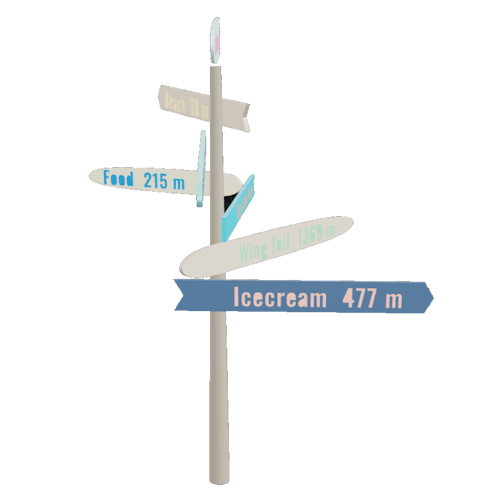
The most visible thing about a real fingerpost is that it almost never looks symmetrical.
Pick any house in the northern hemisphere and run the bearings to a few popular destinations. From a cabin in southern Sweden, "Stockholm" is somewhere around 25°. "Berlin" lives near 200°. "London" is closer to 240°. "New York" is up at 305° because the great-circle line bends north over Greenland. There's no rhythm to those angles. The sign will have plates clustered on one side and a wide gap somewhere else, and it will look unfamiliar to anyone used to symmetrical decorative signs.
That asymmetry is the point. It's also the most common reason home-built fingerposts get rebuilt: the maker eyeballs the angles to make the sign look "balanced," and then a guest with a phone notices that the New York plate is pointing at the neighbour's barn.
If you want a symmetrical sign, you want a decorative one. If you want a sign that points correctly, you have to accept that the natural geometry of the world is uneven, and that the sign will reflect it.
Plate hierarchy: what matters more than what
Once you've committed to real bearings, the next decision is the order and importance of plates from top to bottom of the post. There are three sensible approaches, and they tend to suit different kinds of signs.
By distance, near to far. The shortest journeys go on top, and the plate with the longest distance sits at the bottom. This is the classic look used by trail signs and harbour markers. It reads naturally because shorter trips feel more important when you're standing in front of the sign and thinking about where to go right now.
By distance, far to near. The reverse — the longest trip is at the top, and your local destinations are nearer the bottom. This is the look you see at airports and railway stations: long-haul on top, short-haul below. It works well for signs that are about ambition and reach rather than immediate navigation.
By personal importance. Hierarchy comes from the relationship, not the distance. A family cabin sign might put "Mum and Dad" on top regardless of where they live. A trailhead sign might put the safe shelter on top because it's the one you need in bad weather.
Whichever you choose, pick one and apply it consistently. A sign that mixes hierarchies — distance for some plates, importance for others — looks improvised.
Should every plate be the same size?
There's a temptation to make every plate identical. It looks tidy on the screen, and it's easier to cut. But a real fingerpost almost always benefits from at least some size variation. A plate that sits high on the post can afford to be longer because the eye reads it from below. A plate near the bottom looks heavy if it's the same length as the one above it.
Two practical rules of thumb:
- Cap height before length. Decide how tall the destination text needs to be for the viewing distance you expect, then size the plate around the text. A plate sized for the wood is a plate where the text is too small.
- Vary length, not height. If you're going to vary plate dimensions, change the length and keep the height (the dimension across the arrow's "wing") roughly constant. That keeps the sign legible from a distance.
Tervika's Master Template lets you set these defaults globally and then override them on individual plates when you need to. That's the structure most signs actually want.
Common mistakes that ruin a real sign
A lot of fingerposts fail in the same handful of ways. They're worth knowing before you start.
Confusing magnetic and true bearings. A magnetic compass points at magnetic north, which is somewhere in northern Canada and moves measurably every year. A true bearing points at the actual North Pole. The difference between them — magnetic declination — varies from a few degrees in central Europe to fifteen or twenty degrees in parts of North America. If you set your sign using a phone's magnetic compass, your plates will be off by exactly the local declination. Always use true bearings unless you have a specific reason not to.
Setting the sign the day you cut it, not the day you mount it. This sounds obvious, but it catches people. If the sign sits in the workshop for three months and the customer changes the planned location by twenty metres, the bearings change. They don't change by much over twenty metres for distant destinations, but for nearby ones they change a lot. Calculate the bearings from the actual mount point, ideally measured with a GPS receiver or a satellite map.
Forgetting which way is up. A fingerpost sign has to know which direction is north. Most installers think they'll remember when the time comes; almost none do. Put a small mark on the post — a notch, a label, a discreet "N" — that tells you which side faces north. Some makers cut a flat into the post specifically so the sign can only be installed in one orientation.
Building the sign square to the surroundings. The most painful version of this. A sign installed parallel to a fence or path will look natural, but if you didn't account for that fence's orientation when you set the bearings, the plates will all be off by however much the fence is rotated from north. A sign should be set to the world, not to the local geometry.
Mounting and exposure
Bearing accuracy is one half of the job. The other half is making the sign survive long enough to keep being accurate.
A few details matter more than they seem to:
- Post depth. A fingerpost is a lever. Wind catches the plates, and the post wants to pivot. Bury at least a quarter of the post height, more in soft ground, and consider a concrete collar at the base.
- Top weather cap. End grain at the top of a wooden post drinks water. A simple sloped cap or a piece of zinc adds years to the lifetime.
- Plate spacing. If plates are stacked too tightly, they form a flat sail that wind grabs. A small vertical gap between plates lets the wind through.
- Hardware reach. Whatever you use to attach the plates — screws, lag bolts, through-bolts — has to clear the post's structural core. On a 100mm post, a 60mm screw is plenty. On a 150mm laminated post, you may need something longer to reach beyond the glue line.
Before you cut
The single best thing you can do before turning on the saw is preview the sign in three different ways: from the side, from above, and as a 3D render. The side view tells you about hierarchy and proportion. The top-down view, with a compass overlay, tells you whether the plate angles look right relative to landmarks you know. The 3D render tells you whether the whole assembly reads as a sign or as a craft project.
If anything looks off in any of those views, fix it before exporting. Wood is patient until it isn't. The half-hour you spend tweaking the preview is half an hour you don't spend recutting a plate because the bearing was set from the wrong location.
A fingerpost sign that points correctly is a small, satisfying piece of physical infrastructure. The geometry is given to you by the world; the only thing you control is whether you respect it.